React Expandify 🚀
Animated, lightweight expandable components for React. No extras, just effortless expand and collapse.
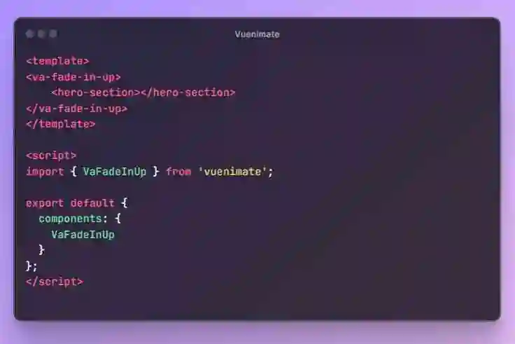
📸 Demo
🚀 Features
- 🎛 Plug and Play: Get started instantly, no complicated setup!
- 🌈 Elemental Freedom: Use any HTML element as your expandable container.
- 🎨 Your Style, Your Rules: Easy-to-add custom classes.
- ⏱ Tick Tock Goes The Clock: Control the expand and collapse speed to the millisecond!
📦 Installation
Add React Expandify to your project with npm:
npm install react-expandify
Or use yarn:
yarn add react-expandify
💡 Usage
Basic example:
import { Expandable } from 'react-expandify';
import 'react-expandify/dist/style.css';

const MyApp = () => (
  <Expandable expanded>
    <p>Your awesome content here!</p>
  </Expandable>
);
📚 Documentation
PropertyTypeDefaultDescriptionexpandedbooleanfalseDetermines whether the content is expanded or not.childrenReactNode–Children to be rendered inside the component.elementTypeJSX.IntrinsicElements'div'The HTML element type for the Expandable component.expandDurationnumber300Duration for the expand animation in milliseconds.collapseDurationnumber300Duration for the collapse animation in milliseconds.easingstringease-in-outEasing function for the expand and collapse animations.classNamestring–Additional className for the Expandable component.onCollapse() => void–Callback when the content has collapsed.onExpand() => void–Callback when the content has expanded.
✨ What You Can Create
Tree view
Accordion component
Toggles
More examples coming soon…
🙏 Contributing
Got ideas or bug reports? Open an issue or send a pull request!
📄 License
Licensed under the MIT License. See LICENSE for more details.
Crafted with 💖 by Armen Nersisyan